Hello everyone and welcome to QlikFreak. I know it’s been a while since our last post, I’m sorry! We’ve been very busy with new projects, hiring extra consultants for our firm and signing some interesting partnerships. In fact, I’m glad to announce that Evolcon is now an official Qlik Implementation Partner, so if you need any help in developing stunning apps or fine-tuning your current platforms, be sure to visit our website and leave us a message. We’ll be happy to assist you on-site or remotely 😉
Now, for today’s post I want to share an interesting Qlik Sense app I’ve been working on. Yeah, you heard that right, Qlik SENSE. I must admit that once you create a robust extension library and get used to the not-so-flexible grid system, developing in Sense can be quite fun too (especially after the June 2017 release with the R / Python integration, visual data preparation and cool new charts). So let’s get started, because today we’ll go out for a ride!

About Ecobici
Today’s post is about Ecobici, Mexico City’s public bike sharing system. Before diving into the data, let me tell you how it works. Any citizen can buy an annual subscription to this program for $416 MXN (around $24 USD) and get unlimited access to the bike network (there are also weekly plans for visitors). The idea is simple: you get to one of the 450 stations around the city, swipe your card and pick up a bike.

Once you get to your destination (same or different station), you secure the bike to the bar and swipe your card once again. Easy, right? You can perform all the trips you want from 5 am until midnight (Mon-Sun) as long as they last less than 45 minutes. If you break that rule and keep the bike more time, you’ll have to pay an extra fee.

As most of the public programs in the city, Ecobici shares some information about its operations directly in their website. There’s a REST service for the catalogs and a couple of CSV files for the trips, so I decided to create an application to analyze how cyclists behave in my hometown. As always, you can download the QVF and all the associated files here, so don’t be shy and take some time to play with the data!
When Qlik Sense meets Ecobici
The app starts off with a dashboard displaying some interesting metrics such as the number of trips, stations and bikes, the average trip time and even the penalty fees. Accompanying those figures, you’ll also find some other charts that describe the users (age and gender), most popular destinations and the busiest moments of the week.
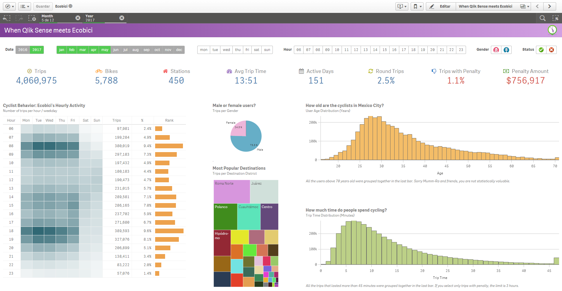
Cool thing about the KPI objects: if you hover the cursor over them, you’ll see a pop-up with a little explanation (those guys at Vizlib think about everything!).

Filters
I finally got my horizontal filters back (thanks Climber!) This is one of my favorite extensions. It’s simple, elegant and you can even use images instead of plain text to give your dashboards a special touch (just copy your custom images to the appropriate folder and make sure that the names match your filters exactly).

Cyclist behavior
My first objective when I got my hands around this data set was to figure out when do people prefer to go out for a ride. While you can visualize this using a couple of line charts, I decided to go for a more complex visualization: the heatmap. Do you remember when you used to play Battleship? Well, in order to interpret this chart, you use the same row vs column logic. Just remember, darker tiles represent a lot of trips.

You can easily find a pattern here. Most of the people use Ecobici to go to from home to the office and viceversa (those dark areas on weekdays around 8 am and 6 pm respectively). However, we can also see some movement at lunch time (we usually eat around 2 pm) and a little bit on Sunday mornings.
Actually, every Sunday before 2 pm some of the most beautiful avenues in the city are closed for motor vehicles so cyclists can enjoy EVERY-SINGLE-LANE (Oh, how I hate that!). Although it doesn’t look so impressive in the previous chart, there’s a place where this is very relevant: the penalty fees.

It looks like users are willing to pay some extra bucks to spend more time cycling with their families and friends on these special events (and I hate them for that).
* Even though there are great heatmap extensions, I wanted to enrich the visualization with the number of trips and some mini bars to highlight the busiest hours, so I went old-school and built it manually using Vizlib’s Table , the native colormix function and a little bit of imagination.
Analyzing distributions
Histograms were finally added as native objects in Qlik Sense June 2017 (which is a relief, because bar charts simply couldn’t do that job!). Now, it’s easy for us to visualize that most of the trips last between 2 and 14 minutes, but some crazy people keep their bike for more than an hour. By the way, if there’s anyone from Qlik reading this, can you make something about the pop-ups? I’d love to customize those labels. Oh, and I also want to change the bubble colors in the distribution plots (just saying). 😛

Looking for more detail?
If you have more questions about the users, stations and routes, you’ll love the next sheet. This massive table lets you dig into the details by displaying several metrics based on a cyclic dimension (thanks for the idea Steve). Interestingly enough, this tab was built using only extensions. No native objects at all.
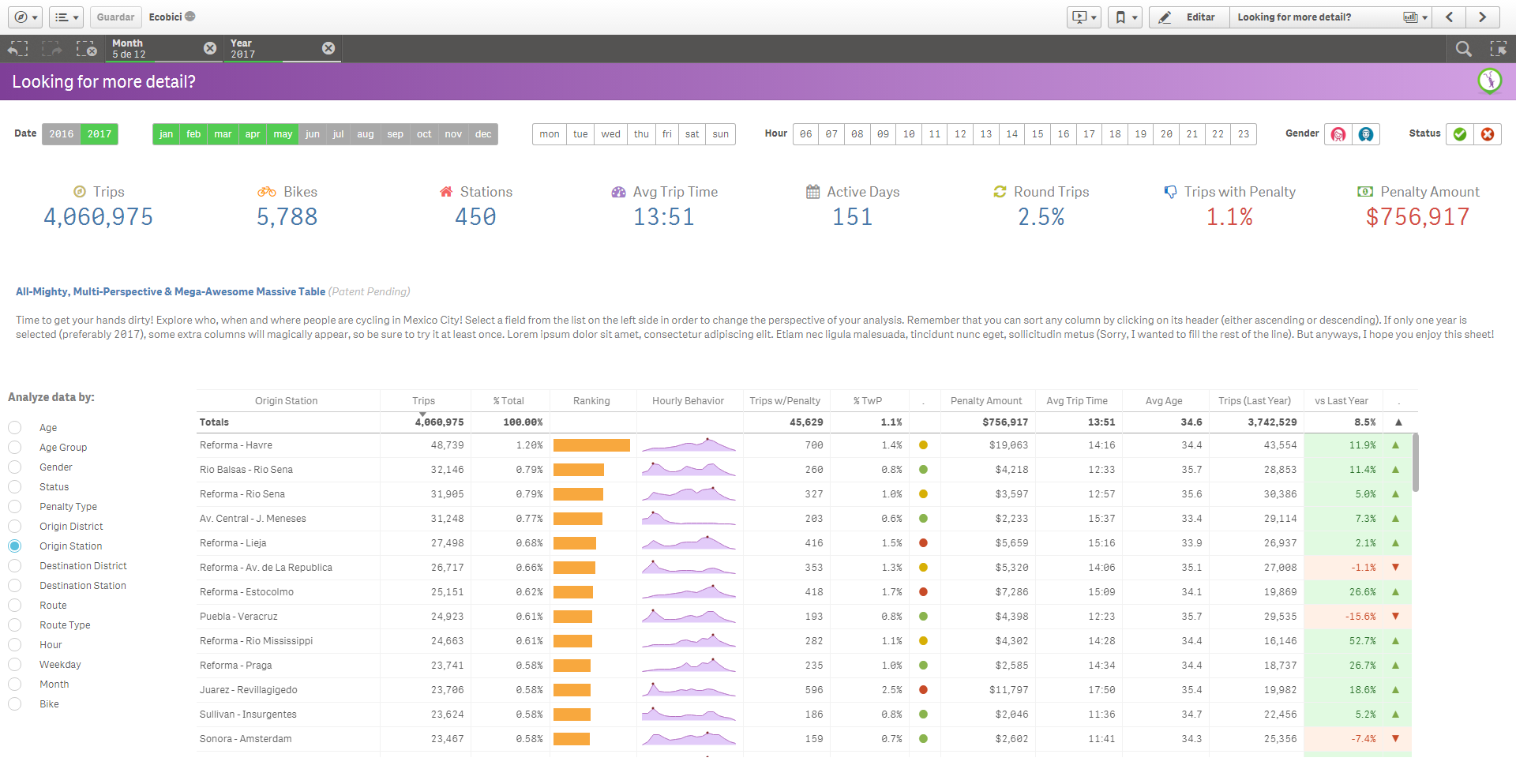
The menu was built using Alex Byrd’s Filed UI extension (check the Always One Selected Value and Default Selection features!) and the table with mini charts, sparklines and other visual cues is courtesy of our friends from Vizlib.
Small Multiples
Not a lot of people use this kind of visualization in their dashboards. However, small multiples (the same basic chart repeated several times over a dimension) are an amazing way to find patterns and spot unusual elements. For instance, if you analyze the hourly behavior by destination district, you’ll notice that some of them welcome lots of cyclists in the morning like Polanco (which makes sense, because there are many offices in this part of town).

Others are quite popular in the afternoon like Buenavista (there’s a huge bus + subway + train station here, so maybe people use the bikes to avoid traffic and then switch to a less tiring mode of transport when returning home) and finally, some display a special behavior like Roma Norte (it has an extra hump around 2 pm, probably explained by the great number of restaurants and bars in the area).
But there are other interesting behaviors. For example, as people get older, they forget about the 9 to 6 work schedule and just go out at lunchtime (that’s actually one of my dreams, just going out for food).

Or you can change the perspective of your analysis and check the trip times and penalties for every day of the week:

Point & Area Maps
Maps are one of those things where Qlik Sense clearly outperforms its older brother, QlikView. Having a native object that supports both point and area maps certainly makes life easier for us developers. Oh, and by “both” I mean one OR the other! 😛

You might not be able to customize dozens of features like when you’re using Qlik GeoAnalytics, but hey, these things work pretty fine for an object that was configured in just 5 clicks.

Interactive stuff
The animations, transitions and better object interactivity are other advantages of using Qlik Sense (or should I say JavaScript extensions?). When used correctly, these features can help you visualize movements more clearly or focus on the most important elements (just don’t exaggerate and animate every single chart in the screen). Take for instance Yianni Ververis’s SenseUI-BiPartite extension (the colorful chart in the middle of the last screenshot). It lets you see how origins and destinations relate (big picture), but if you hover the cursor over an element, all the noise disappears and you can analyze a single item:

C-C-C-Combo Post!
I’m glad you’re still reading this, because the last tab contains something really cool! As many of you already know, my friend and colleague Karl Pover (a.k.a. Povy) has been experimenting with the Qlik API, JavaScript, HTML and CSS so that he can deliver more robust, interactive and useful apps (and he’s my partner at Evolcon, so you should definitely hire us!).
Well, I decided to put his skills to the test and asked him to create an extension for this app (you know how competitive Qlik developers are). Much to my surprise, two hours later he replied with the first version of the extension!

After trying different layouts and adding some extra features, we ended up with this object (and by “we” I mean Karl doing the coding and me giving my opinion. That’s what I call teamwork. Hell yeah.)

When you select a route, the app shows you both the origin and destination stations with Google Street functionality and a map with the easiest route (bike route obviously). There’s also a label with the distance and the time Google thinks you’ll spend cycling from point A to point B so you can compare it to the historical values recorded in the CSV files.
If you want to know more about how he built this extension and get some useful, geeky tips, you should totally visit his blog, Harvesting Wisdom (A rumination on data discovery). Who the hell uses the word “rumination”?

Mr. Ruminations says he will publish the article next week, but who knows? Karl and timelines aren’t exactly best friends. However, you can let him know you’re waiting by using the hashtags #WeAreWaitingKarl and #ComeOnBitch in Twitter. (Please, do so.)
Final Thoughts
Well, that’s pretty much it. I hope you liked today’s story. Hopefully, I’ll be posting more frequently in the next months, so stay tuned! As always, if you have any requests, questions or comments, be sure to leave them in the section below. Oh, and don’t forget to share both this and Karl’s stuff in Twitter or LinkedIn (we have very low self-esteem and we need social recognition).
Keep Qliking. Until next time!

Very nice indeed
This is great Story to read, I am in love with Qlik Sense now. Thanks Julian & Karl showing us how beautiful and awesome and qlik sense app can be developed. As a developer now i am more motivated and confident to use techniques as you used and build a better visualizations and stories. Looking forward to more such qlik sense apps and blogs. Thanks for sharing.
So cool…,absolutely loving it….great work Julian
As always Julian, wonderful post. I have a few of yours to catch up on but this was a good one to see what the guys at Evolcon are up to 🙂