Category: Visualization

VIWICUMO: Slope Charts

Hello everyone and welcome to QlikFreak, the most reliable blog in the web, with consistent updates and definitely no multi-year hiatus where the author experienced an existential crisis. My name is Julian Villafuerte and yes, I’m still alive. Recently, I decided it’s time to get back to the things I love the most: broidery, newspaper crosswords and birdwatching. But, since it’s getting a little cold outside and I haven’t bought a newspaper in 25 years, I guess I’ll have to resume my blogger career as well.


VIWICUMO (no, that’s not a typo)

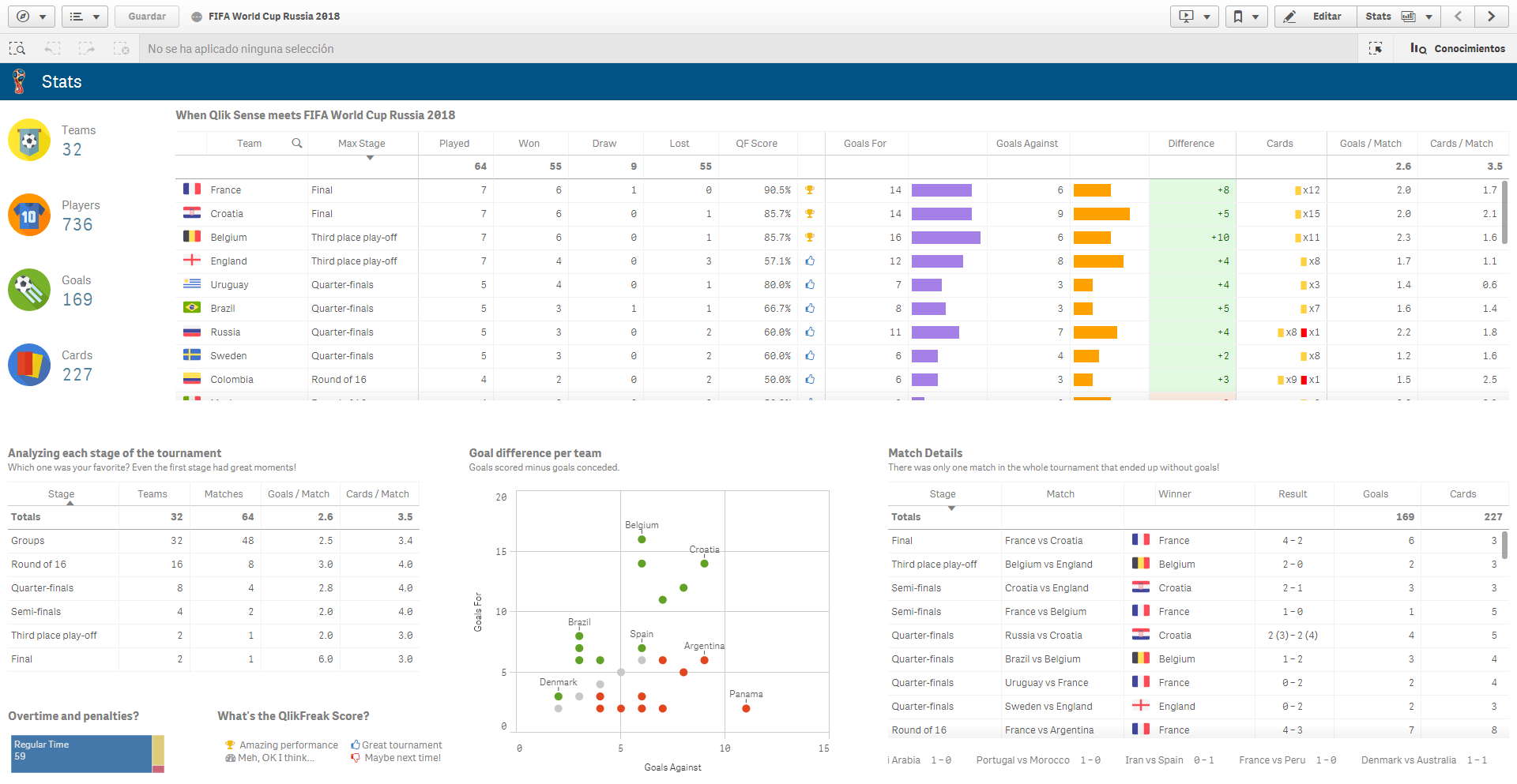
If you’ve been working with data visualization for a while, you’ll know that there are some charts you can never get rid of. Regardless of the industry, audience, or business process you’re analyzing, 99% of the dashboards you deploy will feature tables, bar charts, and line charts. And rightfully so. Those visualizations are super useful, flexible, and easy to use. Most data experts will try to deny it, but even pie charts have a special place in our hearts.

However, there are other visualizations that are equally amazing but tend to run away from the spotlight. Let’s be honest, you’ll never see a violin plot or a scatterplot matrix in the sales report that Karen from accounting has been sending every Thursday since 1985. Maybe it has to do with the purpose they serve, their complexity or the lack of data related skills in our companies, but sadly, these stars don’t shine as bright as the others. For this reason, I decided to create a new series called VIWICUMO: Visualizations I wish I could use more often (patent pending, LOL). To get things started, we’ll discuss the poor man’s line chart, the king of the Δy / Δx, none other than the slope chart.

Continue reading “VIWICUMO: Slope Charts”

When Qlik Sense meets FIFA World Cup

Hello everyone and welcome to QlikFreak! In the last few weeks, we’ve seen a lot of interesting things happening in the Qlik ecosystem. Personally, I’ve been playing a lot with the latest Qlik Sense release (yeah, the one with “the beast”) and I must admit it’s really cool. I specially liked the fact that you can change the grid size whenever you like and the new “Publish” option in the hub (sometimes, those small details make your life much better!). There are a couple of new courses available in the QCC, the data literacy initiatives are getting better and Qlik acquired Podium Data, which certainly will bring a new perspective to the company.

In addition to these events, I’m sure you’ve been extremely busy with other critical issues like scheduling fake meetings so you can watch the world cup in the meeting room with the huge screen. (Yes, I know you had a PowerPoint presentation in your screen, but you were watching all the games in your tablet, Maurice. You should be ashamed!)

Honestly, this was one of the best world cups I’ve seen (especially if you compare it to the last one!). We had great games, some unexpected results, a couple of heartwarming moments and of course, dozens of high quality memes. Actually, now that the dust has settled a little bit and everyone is getting back to their standard routine, why don’t you take some time to relax and analyze what happened during the tournament with a Qlik app? Get ready, because today Qlik Sense will meet the FIFA World Cup Russia 2018!

37_01

Continue reading “When Qlik Sense meets FIFA World Cup”

Widgets 101

Qlik Sense is all about empowerment and extensibility. Whether you are a business user designing a new dashboard just by dragging and dropping objects in your browser or an experienced developer coding extensions, mashups and custom connectors, this platform always gives you the chance to challenge yourself and create something completely new.

In today’s post we’ll explore widgets, one of the easiest ways to build your own visualizations in Qlik Sense. In my opinion, this is a great first step if you’re a newbie or you’re transitioning from QlikView because, unlike JavaScript extensions, widgets are more accessible to people without programming experience and allow you to create useful things early in the learning process.

As usual, this post will include random tips and some finished goodies so you can dissect and modify them as needed! 😉 (Spoiler alert: Today we’ll be working with KPIs!)

35_01

About Widgets

Simply put, widgets are visualization objects that you can build using HTML and CSS. Once deployed, they can be created and configured just as any other chart in Qlik Sense.

While extensions are relatively simple to develop, they pose a big challenge for non-technical people like me because they involve some knowledge about JavaScript and other dark arts such as RequireJS and D3. These skills are not super-difficult to acquire, but they demand a fair amount of time and effort before you can create something decent.

If you want to know more about extensions, follow Karl Pover’s journey to become a Qlik Sense Developer and this amazing video colletion from Speros Kokenes. 

In contrast, widgets rely on earthly technologies, namely HTML and CSS. Luckily for us, these two are much simpler to learn and have a lot of cool things to offer to our dashboards. Don’t worry, even if you have never heard of them, you’ll be able to create not-so-awful-and-almost-cool visualizations right after the first tutorial. Continue reading “Widgets 101”

When Qlik Sense meets Ecobici

Hello everyone and welcome to QlikFreak. I know it’s been a while since our last post, I’m sorry! We’ve been very busy with new projects, hiring extra consultants for our firm and signing some interesting partnerships. In fact, I’m glad to announce that Evolcon is now an official Qlik Implementation Partner, so if you need any help in developing stunning apps or fine-tuning your current platforms, be sure to visit our website and leave us a message. We’ll be happy to assist you on-site or remotely 😉

Now, for today’s post I want to share an interesting Qlik Sense app I’ve been working on. Yeah, you heard that right, Qlik SENSE. I must admit that once you create a robust extension library and get used to the not-so-flexible grid system, developing in Sense can be quite fun too (especially after the June 2017 release with the R / Python integration, visual data preparation and cool new charts). So let’s get started, because today we’ll go out for a ride!

33-07

About Ecobici

Today’s post is about Ecobici, Mexico City’s public bike sharing system. Before diving into the data, let me tell you how it works. Any citizen can buy an annual subscription to this program for $416 MXN (around $24 USD) and get unlimited access to the bike network (there are also weekly plans for visitors). The idea is simple: you get to one of the 450 stations around the city, swipe your card and pick up a bike.

Ecobici Mexico City

Once you get to your destination (same or different station), you secure the bike to the bar and swipe your card once again. Easy, right? You can perform all the trips you want from 5 am until midnight (Mon-Sun) as long as they last less than 45 minutes. If you break that rule and keep the bike more time, you’ll have to pay an extra fee.

33-06

As most of the public programs in the city, Ecobici shares some information about its operations directly in their website. There’s a REST service for the catalogs and a couple of CSV files for the trips, so I decided to create an application to analyze how cyclists behave in my hometown.  Continue reading “When Qlik Sense meets Ecobici”

Just Qlik it: Electoral Gauge Chart

Hey everyone! Ready for another installment of our beloved section Just Qlik It? What? You forgot about that section? Well, for nearly two years so did I, but don’t worry, because it’s time to bring it back!

When I started this blog in 2014, I wrote a couple of posts under a category called Just Qlik It. These were supposed to be small recipes that everyone could just copy and paste in their apps. My idea was to contribute to your personal Qlik library (that messy file we all have where we store cool visualizations and useful chunks of code to reuse them later on). However, for some reason I forgot about that concept and kept going with other kind of posts… up until now!

Today’s snippet is a chart that you’ve seen a thousand times in the last few days: the electoral gauge chart. Even though it is really simple, its rectangular shape makes it very flexible when it comes to fitting into difficult spaces (you can make it wider or taller without impacting its aesthetics or functionality).

29_01

It is also one of those noble visualizations that go well with almost any other object, just like a white collared shirt in your wardrobe (or so says my girlfriend). By mixing it with some images and text objects, it can become a great way to display the most relevant metrics in your dashboards.

As usual, you can download all the related files here or here, and the comment section is ready for your enquiries. On to the recipe!

Electoral Gauge Chart

1.- Create a new gauge chart. Don’t include any dimension and use a dummy expression like this: Continue reading “Just Qlik it: Electoral Gauge Chart”

When QlikView meets the blockbusters

The associative model is definitely one of the best features in the Qlik platform. It is simple, elegant and intuitive but, at the same time, it is a very powerful tool that helps us unveil the stories behind our data.

When I attended my very first QlikView training, I remember Karl Pover used a generic demo called Movies Database to explain the navigation schema. Even though the app wasn’t exactly breathtaking, it was a great way to understand that every selection turns green, the associated elements remain white, and the unrelated items become gray.

28_01.png

From that day on, every time I had to explain the associative model, I relied on the always-available, rarely-updated but still-pretty-good, Movies Database demo that is installed with any version of QlikView. Up until now…

A couple of weeks ago, I was working with Daniela Lucero, one of the youngest consultants in our team, when I realized that my examples about The Matrix, Fight Club and Titanic were not making much sense to her because… well, she was 3 years old when those movies came out… So, we decided to take advantage of the Qlik REST Connector and refresh this old classic.

Daniela: Hello everyone, I’m Daniela and I’ll be using the orange font throughout this post! We took this opportunity to experiment with some atypical features in QlikView. To start with, we chose a dark background (which is usually a big gamble). We also decided to hide the tab row and use a custom-built menu instead, explore different wireframes, and use eye-catching visualizations such as infographics, image-based tables and even some extensions.

28_02.png

As usual, we’ll walk you through the most relevant features in the app (download here or here) while sharing technical recipes and useful tips regarding data visualization. We had a lot of fun creating this app, so we hope you like it! Continue reading “When QlikView meets the blockbusters”