Tag: kpi

Widgets 101

Qlik Sense is all about empowerment and extensibility. Whether you are a business user designing a new dashboard just by dragging and dropping objects in your browser or an experienced developer coding extensions, mashups and custom connectors, this platform always gives you the chance to challenge yourself and create something completely new.

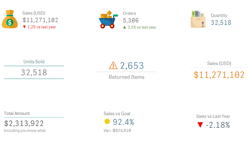
In today’s post we’ll explore widgets, one of the easiest ways to build your own visualizations in Qlik Sense. In my opinion, this is a great first step if you’re a newbie or you’re transitioning from QlikView because, unlike JavaScript extensions, widgets are more accessible to people without programming experience and allow you to create useful things early in the learning process.

As usual, this post will include random tips and some finished goodies so you can dissect and modify them as needed! 😉 (Spoiler alert: Today we’ll be working with KPIs!)

35_01

About Widgets

Simply put, widgets are visualization objects that you can build using HTML and CSS. Once deployed, they can be created and configured just as any other chart in Qlik Sense.

While extensions are relatively simple to develop, they pose a big challenge for non-technical people like me because they involve some knowledge about JavaScript and other dark arts such as RequireJS and D3. These skills are not super-difficult to acquire, but they demand a fair amount of time and effort before you can create something decent.

If you want to know more about extensions, follow Karl Pover’s journey to become a Qlik Sense Developer and this amazing video colletion from Speros Kokenes. 

In contrast, widgets rely on earthly technologies, namely HTML and CSS. Luckily for us, these two are much simpler to learn and have a lot of cool things to offer to our dashboards. Don’t worry, even if you have never heard of them, you’ll be able to create not-so-awful-and-almost-cool visualizations right after the first tutorial. Continue reading “Widgets 101”
Just Qlik it: Double Gauge

‘Just Qlik it’ is a new section of our blog that focuses on sharing useful components… that kind of objects that are not incredibly complex, but are easy on the eye and convenient to have around.

On our first delivery, I’d like to share a double gauge that gets along pretty well with comparisons between ratios (for example, net and gross margins).

9.1

You can easily copy, paste and configure this component by modifying the colors and formulas in the Presentation tab. Just remember that there are two independent gauges and that you should include your formula in the Lower Bound of the second segment.

You might also want to change the Min and Max values allowed. If your numbers are usually between 0% and 30% there’s no need for a gauge that goes all the way to 100%.

9.2

[ Download File ]

I often use this kind of representation to highlight the main KPIs of the tab and reinforce them with a detailed table in the lower part of the screen. In the downloadable file, most of the objects are dummies created only to Continue reading “Just Qlik it: Double Gauge”

Infographics in QlikView Vol. 2

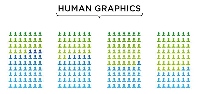
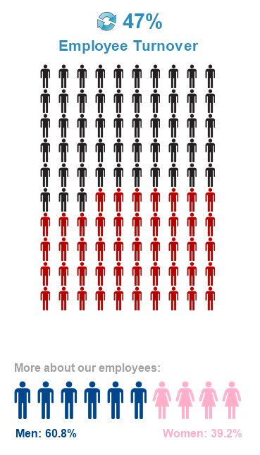
I was wandering around my usual QlikView blogs when I found a post by Rebecca Camper (follow her design blog, INTUIQLIK for stylish ideas!) where she showed some cool data visualizations from Simon Spring, a canadian designer. All of them were easy to the eye, but I found this one especially interesting: RebCam Coincidentally, later that day I found this other post in LinkedIn that used infographics to illustrate employee satisfaction. It showed some curious numbers about why people stay in their jobs, reward systems and work-life balance.

Linked2
So anyway, long story short, inspiration came and here’s the second volume of Infographics in QlikView. As you remember, in our last tutorial I showed you how to use bar / block charts, images with transparency and layers to create something like this: informejor
Today, we’re going to work with pivot tables and some images to create these: New2


Tutorial

As always, you can download the ZIP package that contains the QVW, images and data sources needed to create all the objects shown above.

1.- First, we will create a pivot table with two calculated dimensions (same expression for both): Continue reading “Infographics in QlikView Vol. 2”