Category: Opinion

Mastering Qlik Sense

In ancient times, there were not a lot of options to learn QlikView. The easiest one was to enroll in one of QlikTech’s official courses. However, they were not as frequent (nor as cheap) as you’d like. Most of the Qlik-dinosaurs… I mean, the most experienced consultants I know, learned this way. The less fortunate (i.e. trainees like me), were forced to follow the exciting and not-at-all depressing path of reading the documentation files. Yeah, those massive PDFs that got installed alongside QlikView with 2,750 pages full of fun! Sounds useful, doesn’t it?

TRUMP

Luckily, those days are far over. Today, you can choose from a wide variety of learning options. The official Qlik courses are still there, but now they are taught much more often and in different languages and cities all around the globe. Some partners (like us), have even developed our own content to give customers a better experience with more examples and real-world problems.

Do you hate large groups of people? No problem, you can enroll to Shilpan’s course in Udemy or spend some time navigating in the Qlik Continuous Classroom from your office or home. Are you already an expert? Well, extend your skills with advanced courses like the Masters Summit, Qlik Sense Deep Dive or Websy / Vizlib’s workshops. Even the official (and super boring) documentation has evolved into a friendly portal that you can access anytime! Continue reading “Mastering Qlik Sense”

Double Qlik?

Time to write another philosophical post that will upset some people and will bore some others to death. Hell yeah. But don’t worry, we’ll also have fun stuff, so bear with me. Here’s my story: In the last few months, I’ve been working a lot more with Qlik Sense and, even though I’ve learned to love it, I still have some doubts about its adoption and the future of the Qlik platform in general.

A few days ago, I saw a post by Qlik Luminary Aaron Couron where he asked the world a simple question: QlikView or Qlik Sense? What’s your preference? While I was reading the answers, I remembered many treads I’ve encountered in QlikCommunity and some good discussions we’ve had in our Qlik Dev Group events, but it specially reminded me of the comments I got after tweeting these images not so long ago:

32_01

32_02

Some people favored one over the other, some argued that both should coexist and some others simply went nuts. But regardless of which side you choose, it’s amazing to see the number and variety of opinions in this regard. In a way, I find it interesting how we’re still asking ourselves if this town is big enough for two Qliks. After all, Qlik Sense was released almost three years ago, which in technology standards is a lot of time!

Don’t forget to check Aaron’s full post here. Lots of cool stuff!

Like many of you, I’ve grown quite fond of Qlik Sense as well. It has many advantages like a flexible security schema, more competitive prices and amazing governability in terms of its users, data, apps, metrics and pretty much everything else. However, I don’t think I’m ready to get rid of QlikView just yet.

In the meantime, I also started questioning myself about how the users, developers and even our business model have changed recently. Even though I agree with Stephen Few regarding the soundness of Gartner’s Magic Quadrant (witness the mega-burn here), that’s definitely a message we should not ignore.  Continue reading “Double Qlik?”

Qlik Dev Group & Masters Summit for Qlik

In the last few years, I have attended several Qlik-organized meetings like Qonnections and –believe me– those guys really know how to host an event! Usually, there are great presentations, delicious food and interesting announcements. However, I’ve always felt that they are more focused on the customers, partners and sales people.

In contrast, independent events like the Qlik Dev Group and the Masters Summit have something special: they’re created specifically for the developers which, in my opinion, are the real heroes behind all the Qlik implementations.

Masters Summit for Qlik  24_02

Let me start with the Big Four: Rob Wunderlich, Barry Harmsen, Oleg Troyansky and Bill Lay. The Masters Summit for Qlik is an event launched in 2013 that can definitely take your Qlik skills to the next level. With dynamic presentations and lots of ready-to-use resources, this forum will surprise even the most experienced developers with tricks that will change the way you approach your applications. I had the chance to travel to Copenhagen for last year’s summit and it was absolutely worth it!

24_01

I won’t lie to you, I was a little disappointed when I saw that Rob doesn’t wear his hat all the time and that Oleg got rid of his Qlik tattoo… but after the shock, I really enjoyed their presentations. Their next events will take place in Johannesburg and Texas in September / October, so you’re right on time to book your flights.

Qlik Dev Group 24_03

This dynamic group of Qlik developers is rapidly taking over the world by showing everyone that “Eat. Sleep. Qlik. Repeat.” is the best way to live. Since its inaugural event in London (2014), it has displayed an amazing growth. Today, it holds events all around the world in cities like San Francisco, Amsterdam, Rio de Janeiro, Hamburg, Santiago, Paris and Mexico (it’s pretty much like any Pitbull’s song). Continue reading “Qlik Dev Group & Masters Summit for Qlik”

More things I hate about QlikView

Let me start this post with a question: What is wrong with you people? I was building a little app for analyzing which are your favorite topics in this blog when I came across a sad realization. Even though QlikFreak is full of useful tips about visualization and data modeling, it looks like the most popular post is… well… the one where I complain about everything 😛

22_01

In a way, writing this kind of posts is like talking about my problems with someone who really understands, and since I cannot afford a decent therapist, why don’t we put the constructive spirit aside and discuss the details we hate about the platform we love? Here we go: More things I hate about QlikView!

The extra space in listboxes when you use the AJAX client: I don’t know about you, but I’ve always had mixed feelings about the AJAX client. On one hand, it has great features such as notes, session collaboration and the fact that you don’t have to install anything special in order to use QlikView in desktops, laptops or even mobile devices. On the other hand, it slightly changes the size and alignment of the objects, modifies the amount of visible rows in straight / pivot tables and sometimes adds scrollbars to the charts. And well… I really hate unaligned objects in my apps!!! However, the thing that annoys me the most is, without a doubt, that blank space that appears at the end of certain listboxes:22_02

For God’s sake! Why. Are. You. There?!?! Aaaaarrrrghhhhh!!!

22_04

Bulk Actions: At some point in our lives, we’ve all wished that QlikView had some sort of bulk actions (you know, a magical “Apply to all” button). For example, let’s say you just finished creating a 10-column straight table and you want to center all the labels.  You go to the Presentation tab and try to select all the expressions but you can’t, so you end up either clicking each column and centering its title or changing the object type to a Pivot Table and doing it all at once (I’m not really sure why this only works for Pivot Tables). Continue reading “More things I hate about QlikView”

QlikView Consultant Starter Pack

Unfortunately, a couple of days ago, one of my colleagues invited me to one of those “Why am I even here?” meetings with a new customer. I’m sure you are all familiar with them: long reunions with no objective whatsoever where all the participants strive to look busy and productive, but in reality, they’re not accomplishing anything at all.

In the middle of this rampage (and questioning my very existence out of the boredom), I remembered some “Started Pack” memes I saw earlier that day:

21_01

But then, I started thinking, I’ve never seen a QlikView Consultant Starter Pack. Of course there are several training kits and video collections for beginners, but let’s say you meet someone who has just finished his basic QlikView training. How would you help him equip himself with all the tools and resources that he’ll need for his journey as a new consultant? Well, after some thought I came up with this list (and yes, I managed to do something relevant during that meeting too):

Decent computer

OK, don’t give me that look… Yes, I can see you rolling your eyes already! Wait a minute, this is just a little reminder for the newbies.

21_02

Don’t forget that QlikView models are loaded into RAM. So, if you’re going to work with several millions of records, you’d better get a good laptop (and yes, you’re going to need Windows). Though you can now develop in any browser or mobile device using Sense, let’s be honest: it is much more comfortable to work in your own machine, with all your apps, images and other resources available.

Continue reading “QlikView Consultant Starter Pack”

About Scatter Plots

The Qlik platform is all about analyzing data and making discoveries. However, in order to get valuable insights for your organization, you can’t just go around loading any data source and creating random charts. On the contrary, a good QlikView developer will always strive to use the most appropriate objects for each type of analysis.

Even though classic visualizations such as bar, line or pie charts are essential components of most applications, complex inquiries usually require more sophisticated tools to gain full understanding of the situation and make the best decisions possible. In this regard, one of my favorite visualizations is the scatter plot (Well, scatter plots and histograms, but we’ve already talked about those).

Although not very common, when used adequately, these charts can be real eye-openers. Sadly, its usage is still covered in a veil of mystery for the majority of the business users who –for a strange reason– seem to fear its power. But anyways, back to the story…

This chart stands out due its ability to elegantly handle great amounts of data. Though its simplest form only combines one dimension and two expressions plotted along the x and y axes, you can enrich them in several ways. Let’s start with an easy example:

Scatter_01

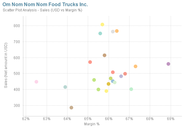
Each bubble in this chart represents one of On Nom Nom Nom’s food trucks. As the y-axis embodies the sales amount, the higher the bubble is, the “stronger” the food truck. On the other end, the x-axis represents the Margin %. Therefore, a bubble far in the right could be categorized as “more intelligent” due to its higher profitability. In this case, the best scenario for the company would be to have most of the bubbles in the upper right corner, meaning that all the food trucks sell a lot but also have good margins.

To make this visualization clearer, we can add reference lines and define static of dynamic thresholds with variables and traditional expressions: Continue reading “About Scatter Plots”