Category: Tips & Tricks

Widgets 101

Qlik Sense is all about empowerment and extensibility. Whether you are a business user designing a new dashboard just by dragging and dropping objects in your browser or an experienced developer coding extensions, mashups and custom connectors, this platform always gives you the chance to challenge yourself and create something completely new.

In today’s post we’ll explore widgets, one of the easiest ways to build your own visualizations in Qlik Sense. In my opinion, this is a great first step if you’re a newbie or you’re transitioning from QlikView because, unlike JavaScript extensions, widgets are more accessible to people without programming experience and allow you to create useful things early in the learning process.

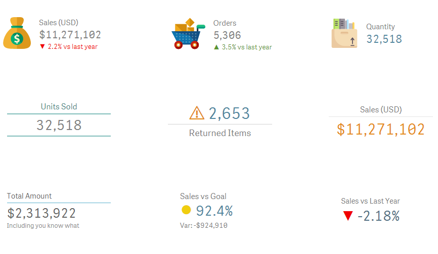
As usual, this post will include random tips and some finished goodies so you can dissect and modify them as needed! 😉 (Spoiler alert: Today we’ll be working with KPIs!)

35_01

About Widgets

Simply put, widgets are visualization objects that you can build using HTML and CSS. Once deployed, they can be created and configured just as any other chart in Qlik Sense.

While extensions are relatively simple to develop, they pose a big challenge for non-technical people like me because they involve some knowledge about JavaScript and other dark arts such as RequireJS and D3. These skills are not super-difficult to acquire, but they demand a fair amount of time and effort before you can create something decent.

If you want to know more about extensions, follow Karl Pover’s journey to become a Qlik Sense Developer and this amazing video colletion from Speros Kokenes. 

In contrast, widgets rely on earthly technologies, namely HTML and CSS. Luckily for us, these two are much simpler to learn and have a lot of cool things to offer to our dashboards. Don’t worry, even if you have never heard of them, you’ll be able to create not-so-awful-and-almost-cool visualizations right after the first tutorial. Continue reading “Widgets 101”

QlikAdvice: Give context to your data

Hello everyone and welcome to QlikFreak. This will be our first post in a new category called QlikAdvice, where we’ll talk about dashboard design in a broader sense. Instead of focusing on technical stuff (we already cover that in our Just Qlik It posts), this section will contain functional tips that will help you present information in an efficient and elegant manner. These principles will be applied to Qlik apps (QlikView and Qlik Sense), but you’ll find out that most of them are useful in other domains as well, from web design to NPrinting Reports, or even PowerPoint presentations (or should I say Qlik Sense Stories?). Today’s topic is an old classic you should never forget: context.

QlikAdvice: Give context to the data to improve the decision-making process

When it comes to analyzing data, context is everything. If you present isolated figures, users will have a hard time trying to find out the real story behind them. As a Qlik developer, it’s easy to fall in the trap and start shooting random KPIs right away. For example, I could start my sales dashboard with something like this:

31_01

OK, we sold 3.56 M in 2016, that’s cool. However, what does this tell me? Was it a good or a bad year for our sales reps? Well, it all comes down to a simple question: “compared to what?”. In order to evaluate their performance, it would be better to have some kind of reference. For instance, the budget:

31_02 Continue reading “QlikAdvice: Give context to your data”

Just Qlik it: Electoral Gauge Chart

Hey everyone! Ready for another installment of our beloved section Just Qlik It? What? You forgot about that section? Well, for nearly two years so did I, but don’t worry, because it’s time to bring it back!

When I started this blog in 2014, I wrote a couple of posts under a category called Just Qlik It. These were supposed to be small recipes that everyone could just copy and paste in their apps. My idea was to contribute to your personal Qlik library (that messy file we all have where we store cool visualizations and useful chunks of code to reuse them later on). However, for some reason I forgot about that concept and kept going with other kind of posts
 up until now!

Today’s snippet is a chart that you’ve seen a thousand times in the last few days: the electoral gauge chart. Even though it is really simple, its rectangular shape makes it very flexible when it comes to fitting into difficult spaces (you can make it wider or taller without impacting its aesthetics or functionality).

29_01

It is also one of those noble visualizations that go well with almost any other object, just like a white collared shirt in your wardrobe (or so says my girlfriend). By mixing it with some images and text objects, it can become a great way to display the most relevant metrics in your dashboards.

As usual, you can download all the related files here or here, and the comment section is ready for your enquiries. On to the recipe!

Electoral Gauge Chart

1.- Create a new gauge chart. Don’t include any dimension and use a dummy expression like this: Continue reading “Just Qlik it: Electoral Gauge Chart”

When QlikView meets the blockbusters

The associative model is definitely one of the best features in the Qlik platform. It is simple, elegant and intuitive but, at the same time, it is a very powerful tool that helps us unveil the stories behind our data.

When I attended my very first QlikView training, I remember Karl Pover used a generic demo called Movies Database to explain the navigation schema. Even though the app wasn’t exactly breathtaking, it was a great way to understand that every selection turns green, the associated elements remain white, and the unrelated items become gray.

28_01.png

From that day on, every time I had to explain the associative model, I relied on the always-available, rarely-updated but still-pretty-good, Movies Database demo that is installed with any version of QlikView. Up until now


A couple of weeks ago, I was working with Daniela Lucero, one of the youngest consultants in our team, when I realized that my examples about The Matrix, Fight Club and Titanic were not making much sense to her because
 well, she was 3 years old when those movies came out
 So, we decided to take advantage of the Qlik REST Connector and refresh this old classic.

Daniela: Hello everyone, I’m Daniela and I’ll be using the orange font throughout this post! We took this opportunity to experiment with some atypical features in QlikView. To start with, we chose a dark background (which is usually a big gamble). We also decided to hide the tab row and use a custom-built menu instead, explore different wireframes, and use eye-catching visualizations such as infographics, image-based tables and even some extensions.

28_02.png

As usual, we’ll walk you through the most relevant features in the app (download here or here) while sharing technical recipes and useful tips regarding data visualization. We had a lot of fun creating this app, so we hope you like it! Continue reading “When QlikView meets the blockbusters”

When QlikView meets PokĂ©mon

Some people build QlikView dashboards to review the financial outcomes of their companies. Others use it to monitor their everyday operations in plants and warehouses. There are individuals who even create applications to analyze fun stuff like the Olympic Games or TV Series. In my opinion, QlikView should be exclusively used to answer humanity’s greatest inquiries and analyze relevant topics that affect our lives and our future; important things such as PokĂ©mon 😛

When I was a kid, I used to play PokĂ©mon games all the time. Blue, Yellow, Silver, Sapphire, Stadium, Snap, Pinball, Trading Card Game, you name it. And well, since everyone’s going a little crazy about PokĂ©mon Go these days, I decided to create a QlikView document based on the original 151 PokĂ©mon in the first generation (speaking about mixing good stuff).

27_01

Today’s post isn’t exactly a tutorial. I’ll just share the QVW I created and highlight some interesting features I think you can use to improve your own applications. Even if you’re not exactly the biggest PokĂ©mon fan, be sure to check it out. I’m sure you’ll find something that strikes your attention!  Continue reading “When QlikView meets PokĂ©mon”

About Slopegraphs and Bumps Charts

Hey everyone! Today’s post answers a request from one of our readers and features two not-so-common visualizations that you can use to make time comparisons: slopegraphs and bumps charts. Although these objects have a very simple nature, they’re also quite elegant and intuitive, so there’s a good chance that they will help you get some unexpected insights in your analyses.

We’ll also discuss one or two tips that can help you improve their readability and make them more meaningful by adding extra context to the data. As requested, the football dataset that we’ve been using lately will give life to our examples! 😉

Slopegraph

Slopegraphs are a great way to compare two points in time. However, instead of describing the ups and downs along the way like traditional line charts, they focus on how the journey started and how it ended. This visualization is the perfect candidate for “then and now” analyses (much like that TV show that presents celebrities and how they looked 30 years ago). * Note to self: stop making that kind of references, people will laugh at you. You should recommend Cole’s blog instead. *

When working with these charts, our brain can easily spot patterns and recognize the distinctive slopes of certain elements in terms of direction or magnitude. It is also an intuitive way of showing how the rankings changed from a point in time to another, as the lines will intersect each other and end up in a different order.

26_01

In this example, we can visualize the performance of all the teams in the Premier League over the last two seasons. Each squad is portrayed by a line and its position and slope depend on the rank achieved in both the 2015 and 2016 tournaments. In order to improve the chart’s readability, you can highlight the selected team by adding some color and changing its line’s width.

26_02

* Fun Fact: This chart is so cool that it made it to the cover of one of my favorite books about data visualization, The Functional Art by Alberto Cairo. Continue reading “About Slopegraphs and Bumps Charts”