Galleries

When Qlik Sense meets FIFA World Cup

Hello everyone and welcome to QlikFreak! In the last few weeks, we’ve seen a lot of interesting things happening in the Qlik ecosystem. Personally, I’ve been playing a lot with the latest Qlik Sense release (yeah, the one with “the beast”) and I must admit it’s really cool. I specially liked the fact that you can change the grid size whenever you like and the new “Publish” option in the hub (sometimes, those small details make your life much better!). There are a couple of new courses available in the QCC, the data literacy initiatives are getting better and Qlik acquired Podium Data, which certainly will bring a new perspective to the company.

In addition to these events, I’m sure you’ve been extremely busy with other critical issues like scheduling fake meetings so you can watch the world cup in the meeting room with the huge screen. (Yes, I know you had a PowerPoint presentation in your screen, but you were watching all the games in your tablet, Maurice. You should be ashamed!)

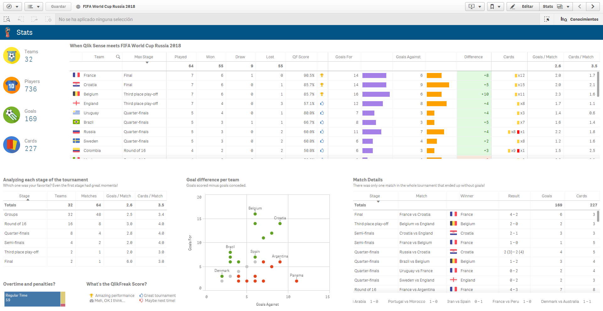
Honestly, this was one of the best world cups I’ve seen (especially if you compare it to the last one!). We had great games, some unexpected results, a couple of heartwarming moments and of course, dozens of high quality memes. Actually, now that the dust has settled a little bit and everyone is getting back to their standard routine, why don’t you take some time to relax and analyze what happened during the tournament with a Qlik app? Get ready, because today Qlik Sense will meet the FIFA World Cup Russia 2018!

37_01

Continue reading “When Qlik Sense meets FIFA World Cup”

Widgets 101

Qlik Sense is all about empowerment and extensibility. Whether you are a business user designing a new dashboard just by dragging and dropping objects in your browser or an experienced developer coding extensions, mashups and custom connectors, this platform always gives you the chance to challenge yourself and create something completely new.

In today’s post we’ll explore widgets, one of the easiest ways to build your own visualizations in Qlik Sense. In my opinion, this is a great first step if you’re a newbie or you’re transitioning from QlikView because, unlike JavaScript extensions, widgets are more accessible to people without programming experience and allow you to create useful things early in the learning process.

As usual, this post will include random tips and some finished goodies so you can dissect and modify them as needed! 😉 (Spoiler alert: Today we’ll be working with KPIs!)

35_01

About Widgets

Simply put, widgets are visualization objects that you can build using HTML and CSS. Once deployed, they can be created and configured just as any other chart in Qlik Sense.

While extensions are relatively simple to develop, they pose a big challenge for non-technical people like me because they involve some knowledge about JavaScript and other dark arts such as RequireJS and D3. These skills are not super-difficult to acquire, but they demand a fair amount of time and effort before you can create something decent.

If you want to know more about extensions, follow Karl Pover’s journey to become a Qlik Sense Developer and this amazing video colletion from Speros Kokenes. 

In contrast, widgets rely on earthly technologies, namely HTML and CSS. Luckily for us, these two are much simpler to learn and have a lot of cool things to offer to our dashboards. Don’t worry, even if you have never heard of them, you’ll be able to create not-so-awful-and-almost-cool visualizations right after the first tutorial. Continue reading “Widgets 101”

When QlikView meets PokĂ©mon

Some people build QlikView dashboards to review the financial outcomes of their companies. Others use it to monitor their everyday operations in plants and warehouses. There are individuals who even create applications to analyze fun stuff like the Olympic Games or TV Series. In my opinion, QlikView should be exclusively used to answer humanity’s greatest inquiries and analyze relevant topics that affect our lives and our future; important things such as PokĂ©mon 😛

When I was a kid, I used to play PokĂ©mon games all the time. Blue, Yellow, Silver, Sapphire, Stadium, Snap, Pinball, Trading Card Game, you name it. And well, since everyone’s going a little crazy about PokĂ©mon Go these days, I decided to create a QlikView document based on the original 151 PokĂ©mon in the first generation (speaking about mixing good stuff).

27_01

Today’s post isn’t exactly a tutorial. I’ll just share the QVW I created and highlight some interesting features I think you can use to improve your own applications. Even if you’re not exactly the biggest PokĂ©mon fan, be sure to check it out. I’m sure you’ll find something that strikes your attention!  Continue reading “When QlikView meets PokĂ©mon”

Countdown

In today’s post, I want to share a simple / not incredibly useful app that I use very often as a QlikView trainer. In my courses, I like to guide most of the exercises step by step and give tips and tricks as we encounter new functions or objects. However, some exercises have better results when working alone, especially when working with charts. For example, when I present themes, containers, tabs and auto-minimize I like to give the students a few minutes to decide the way their applications would look like.

In the beginning, I used to tell them the approximate time that we were going to spend on the exercise and the expected finish hour. As you can imagine, nobody kept an eye on the clock and we always had delays, so one day I created this application. [Download]

12.2The idea is to store the expected time for the exercise in a variable using an input box and after clicking START, the gauge in the right would represent the remaining time using the function now(). When the clock hits the “Red Zone” (another variable), the gauge turns red. Continue reading “Countdown”