Hello everyone and welcome to QlikFreak! In the last few weeks, we’ve seen a lot of interesting things happening in the Qlik ecosystem. Personally, I’ve been playing a lot with the latest Qlik Sense release (yeah, the one with “the beast”) and I must admit it’s really cool. I specially liked the fact that you can change the grid size whenever you like and the new “Publish” option in the hub (sometimes, those small details make your life much better!). There are a couple of new courses available in the QCC, the data literacy initiatives are getting better and Qlik acquired Podium Data, which certainly will bring a new perspective to the company.
In addition to these events, I’m sure you’ve been extremely busy with other critical issues like scheduling fake meetings so you can watch the world cup in the meeting room with the huge screen. (Yes, I know you had a PowerPoint presentation in your screen, but you were watching all the games in your tablet, Maurice. You should be ashamed!)
Honestly, this was one of the best world cups I’ve seen (especially if you compare it to the last one!). We had great games, some unexpected results, a couple of heartwarming moments and of course, dozens of high quality memes. Actually, now that the dust has settled a little bit and everyone is getting back to their standard routine, why don’t you take some time to relax and analyze what happened during the tournament with a Qlik app? Get ready, because today Qlik Sense will meet the FIFA World Cup Russia 2018!
As usual, you can download the app here, but don’t forget to install all these extensions beforehand! We’ll need the Vizlib Library (obviously), the Evolcon Widget Library (our little contribution to the world) and Marquee. If you’re not sure how to install the extensions, you can check the instructions here.
![]()
About the data
All the information that you’ll see in this app comes from two sources. The first one is a JSON dataset I found in GitHub (special thanks to Martin Århof for creating this!). The Qlik REST Connector does most of the work for you. Just create a new connection, paste the address and voilà.

The rest of the data comes from this website. Even if you don’t speak Spanish, I’m sure you’ll understand most of the information there. In order to extract all the fields that I needed, I created a special script using a FOR cycle that read the HTML files directly. If you want to know more about this technique, be sure to check this post (which coincidentally is about football as well).
![]()
Now, let’s check the app!
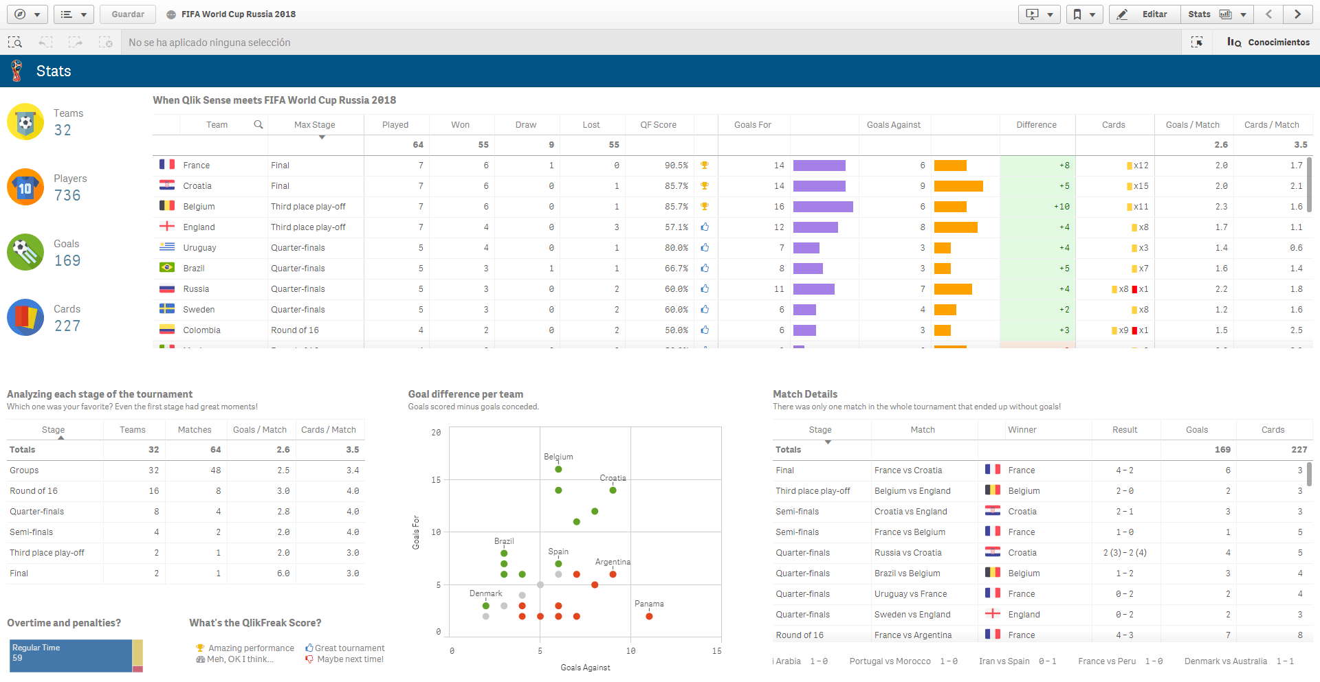
The first sheet contains general statistics about the tournament like the number of teams, players, goals and cards. Since Qlik Sense native tables can be a little restrictive (LOL, “a little”), I decided to use Vizlib tables instead (which is my favorite Vizlib extension, by the way). This allowed me to add some cool details like the team’s flag, multicolor icons and embedded charts.
Qlik Tip: The expressions inside the Vizlib table can be built mixing tiny bits of HTML with standard Qlik stuff. For example, you can insert an image based on your data model:

Or you can build custom expressions to add icons and numbers in different formats (look at the “Cards” column):

![]()
Color encoding
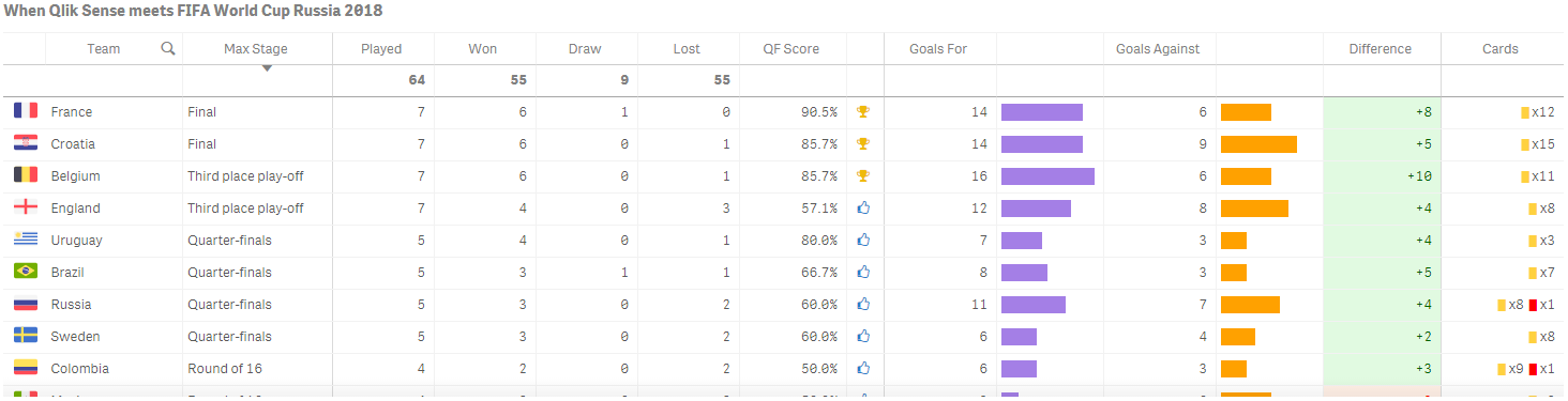
Assigning colors to highlight important points or categorize data is very common in Qlik. Most of the charts have a “Colors and legends” menu where you can add conditional statements and color functions:

Thanks to this trick, analyzing the goal difference per team is much easier:

![]()
Those KPIs look nice, don’t they?
Back the QlikView era, I loved to create mini KPI objects mixing images and labels in different colors and sizes. When I transitioned to Qlik Sense, I realized these tricks were out of scope. At least until I discovered widgets!

I you haven’t done it yet, I strongly recommend you learn a little bit of HTML and CSS and start creating widgets. It’s very simple and you don’t need to be a hardcore programmer to build decent-looking objects. The ones I used for this app are part of our Evolcon Widget Library, a set of super-simple visualizations available in Qlik Branch. Hopefully, we’ll release one or two new charts next month!
![]()
About the players
The second sheet contains some interesting facts about the players.
If you’re trying to explain the associative model to a newbie, try showing him the charts in the upper part of the screen. When I select Manchester City, I can see that they sent 16 players to the World Cup. By looking at the rest of the charts, I can also see that most of them are defenders and represent 8 different countries!

![]()
Demographics: Age & Height
Did you know that England had one of the youngest squads in the tournament? (Average Age: 25.3) Interestingly, all of them play in their home country. In contrast, none of the 23 players of the Swedish national team play in Sweden.

I was a bit surprised by the average height of some teams. In my country, I’m usually considered a tall person (1.80 m). However, if I were a Serbian player, I’d be one of the shortest in the team. The third shortest player, to be precise. Damn.

Oh, and this might be no surprise, but the goalkeepers are consistently taller than everybody else!

![]()
Goals & Cards
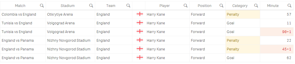
The next two tabs present information about the goals and cards. It’s very curious that so many things happened in stoppage time, don’t you agree? (22 goals and 34 cards!)

If you select any category, you can dig into the details. For example, you could see that Harry Kane scored 5 out of his 6 goals against Tunisia and Panama or that half of them were penalties.
![]()
Match Details
This is one of my favorite sheets in the app. Just select a match and you’ll see a lot of details about the game! The players highlighted in red and green are the substitutions. The gray ones saw no action.

I wanted the stadium image to be dynamic, so I couldn’t use the native image object. Therefore, I decided to add another “QlikFreak KPI” but without any expressions 😛
Qlik Tip: The blue bubbles in the map represent all the host stadiums (always visible). However, the red dot is where the match was disputed. I achieved this by adding two layers: the real stadium and a dummy island table.
![]()
Random Stuff
I the last tab, you’ll find a map with all the countries that were involved in this World Cup. The colors represent how far the team got in the tournament. You’ll also see some images with my favorite moments and a section that analyzes the players’ names (sorry, I was a little bored at the moment). By the way, did you notice that 22 out of the 23 Icelandic players have a last name that ends with “*son”?

![]()
Now it’s your turn!
I really enjoyed creating this app, so why don’t you give it a shot? Seeing what I built probably gave you some ideas, so don’t be shy an experiment with this QVF. As I mentioned at the beginning of this post, you can download the app here. If you want to start from zero (well, not exactly from scratch, but with decent tables), you can download the complete, clean and standardized QVDs here. If you create something cool, please share a pic in Twitter 😉
Well… I think that’s it. I hope you liked today’s post. As always, if you have any requests, questions or comments, be sure to leave them in the section below.
Until next time!

Hi.
I’d like to know how to disable help on pointer when in the expression editor in a table column or anywhere in Sense. Instead of helping, it just stays there in the freaking middle and it does not le you program at all. Big swearing… *&%$%&%$#. I hate it.
Hi.
Thanks for sharing the application but we can’t see any visualization as there are some issues in extension or widget set up
b regards,
Ali