Images

Geo… what?

One of the most significant changes Qlik has experienced so far is the substantial growth of their product family. What once was a one-man show, is now a robust portfolio that addresses several business needs. Do you want pixel-perfect reports? Here’s NPrinting. You don’t like in-house deployments? Meet Qlik Sense Cloud. Do you need more data? Welcome to Qlik DataMarket. All these new modules help us work more efficiently, enrich our analyses, and ultimately, make better decisions.

One of the most interesting newcomers in this list is Qlik GeoAnalytics (formerly known as Idevio). Even though it isn’t exactly new, I think there are still some misconceptions around this product. Yes, it is a tool that allows you to create cool maps in Qlik, but there’s much more to it. In this post, I’ll show you some of my favorite features and how they can help you analyze geographic data. This might not be a comprehensive list, but hopefully it will give you an idea of the real potential behind GeoAnalytics.
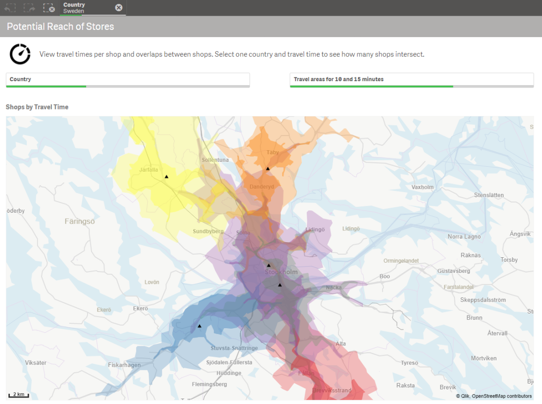
34_01 Continue reading “Geo… what?”

QlikFreak Football

What happens when you mix QlikView with the best football leagues in the globe? In today’s post, I’ll share a little app I created to analyze data about my favorite soccer tournaments like the English Premier League, the German Bundesliga or the Serie A from Italy. So let’s take a break of business oriented dashboards and spend some time reviewing the wins, losses and goals of the last few years.

If you’re a football fan, you’ll stay for the discoveries. If you’re a QlikView enthusiast, you’ll stay for the tips regarding scripting and visualization. If you’re not neither of those, you’ll visit our Random page in order to see funny videos like a pug playing ‘Enter Sandman’ from Metallica in the drums.

As usual, you can download all the related files here. Ready? Let’s get started!

23_01

The first challenge in this endeavor was to find a good data source. However, a static XLS file wouldn’t do the trick. Since we’re in the middle of the season and there are matches every week, we need a way to update our file constantly. Even though it’s not the most common way to extract tables, don’t forget that QlikView can retrieve records from external websites (Data from Files > Web Files).

23_02

After browsing for a while, I found a great sports portal called SkySports where we could get all the information we needed. In order to load it to our model (and since I didn’t want to copy and paste the same code dozens of times), I relied on one of our oldest friends: the FOR… NEXT loop. The structure is not very complex, so I’ll let the code speak for itself: Continue reading “QlikFreak Football”

About Scatter Plots

The Qlik platform is all about analyzing data and making discoveries. However, in order to get valuable insights for your organization, you can’t just go around loading any data source and creating random charts. On the contrary, a good QlikView developer will always strive to use the most appropriate objects for each type of analysis.

Even though classic visualizations such as bar, line or pie charts are essential components of most applications, complex inquiries usually require more sophisticated tools to gain full understanding of the situation and make the best decisions possible. In this regard, one of my favorite visualizations is the scatter plot (Well, scatter plots and histograms, but we’ve already talked about those).

Although not very common, when used adequately, these charts can be real eye-openers. Sadly, its usage is still covered in a veil of mystery for the majority of the business users who –for a strange reason– seem to fear its power. But anyways, back to the story…

This chart stands out due its ability to elegantly handle great amounts of data. Though its simplest form only combines one dimension and two expressions plotted along the x and y axes, you can enrich them in several ways. Let’s start with an easy example:

Scatter_01

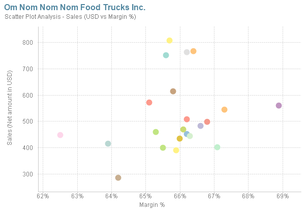
Each bubble in this chart represents one of On Nom Nom Nom’s food trucks. As the y-axis embodies the sales amount, the higher the bubble is, the “stronger” the food truck. On the other end, the x-axis represents the Margin %. Therefore, a bubble far in the right could be categorized as “more intelligent” due to its higher profitability. In this case, the best scenario for the company would be to have most of the bubbles in the upper right corner, meaning that all the food trucks sell a lot but also have good margins.

To make this visualization clearer, we can add reference lines and define static of dynamic thresholds with variables and traditional expressions: Continue reading “About Scatter Plots”

Just Qlik it: Simple Maps

Today’s ‘Just Qlik it’ focuses on using simple maps in QlikView. I’ve been playing with this kind of objects in Qlik Sense recently and I thought it would be good to remember how we created these cartographic visualizations in the old days.

As the ancient masters taught us, before Qlik Sense, GeoQlik and custom extensions, there were scatter charts…

10.9

Tutorial

An easy way to create maps in your applications is to exploit the Google API. As always, the reference material with all the examples is here.

1.- Paste the ‘Google Maps’ tab in your script

2.- Be sure to create the fields for Longitude and Latitude in your data model. If you don’t have this information, you can manually find it online (hahaha) or you can search it within your QV script with a routine like this one: Continue reading “Just Qlik it: Simple Maps”

Infographics in QlikView Vol. 2

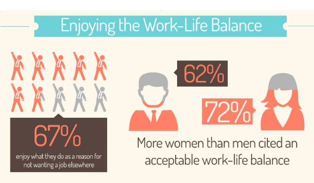
I was wandering around my usual QlikView blogs when I found a post by Rebecca Camper (follow her design blog, INTUIQLIK for stylish ideas!) where she showed some cool data visualizations from Simon Spring, a canadian designer. All of them were easy to the eye, but I found this one especially interesting: RebCam Coincidentally, later that day I found this other post in LinkedIn that used infographics to illustrate employee satisfaction. It showed some curious numbers about why people stay in their jobs, reward systems and work-life balance.

Linked2
So anyway, long story short, inspiration came and here’s the second volume of Infographics in QlikView. As you remember, in our last tutorial I showed you how to use bar / block charts, images with transparency and layers to create something like this: informejor
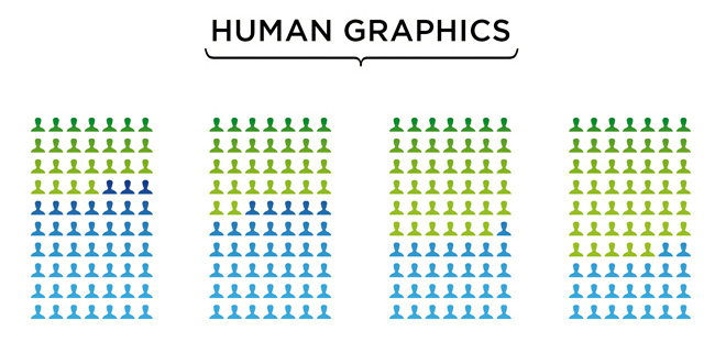
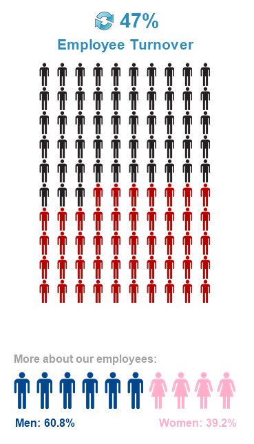
Today, we’re going to work with pivot tables and some images to create these: New2


Tutorial

As always, you can download the ZIP package that contains the QVW, images and data sources needed to create all the objects shown above.

1.- First, we will create a pivot table with two calculated dimensions (same expression for both): Continue reading “Infographics in QlikView Vol. 2”

From QlikView to… Qlik?

Qlik

I don’t know about you, but I’m finding a little bit difficult to embrace certain aspects of the new brand image that QlikView has adopted.

A fresh color palette has complemented the classic green gradients with warmer colors while a couple of orange circles have filled in for the emblematic QlikView swirls. I think that all these changes have reinvigorated the spirit of the platform, especially because they are aligned to its core values: effectiveness, real business value and simplicity.

To be honest, my only real problem is the transformation of the product name itself. If you recall 1994 (or read this post), in the beginning we used to call our favorite BI tool “Quik View” (maybe not very creative, but representative nevertheless).

After that, the name evolved to QlikView, a designation that is specifically difficult for Continue reading “From QlikView to… Qlik?”