Have you ever had one of those “of course I can do that in QlikView” moments? As a Qlik developer it’s not uncommon to find yourself struggling to create a chart or pull off a complex script that nobody asked for, but for some strange reason, you decided to tas a personal challenge. Well, I just had one of those moments.

I couple of days ago I was wandering around my usual blogs when I found a post by Alberto Cairo where he talked about an interactive visualization created by the FiveThirtyEight team regarding the political preferences in the United States. [By the way, if you don’t follow those blogs you are missing a lot of great stuff!]
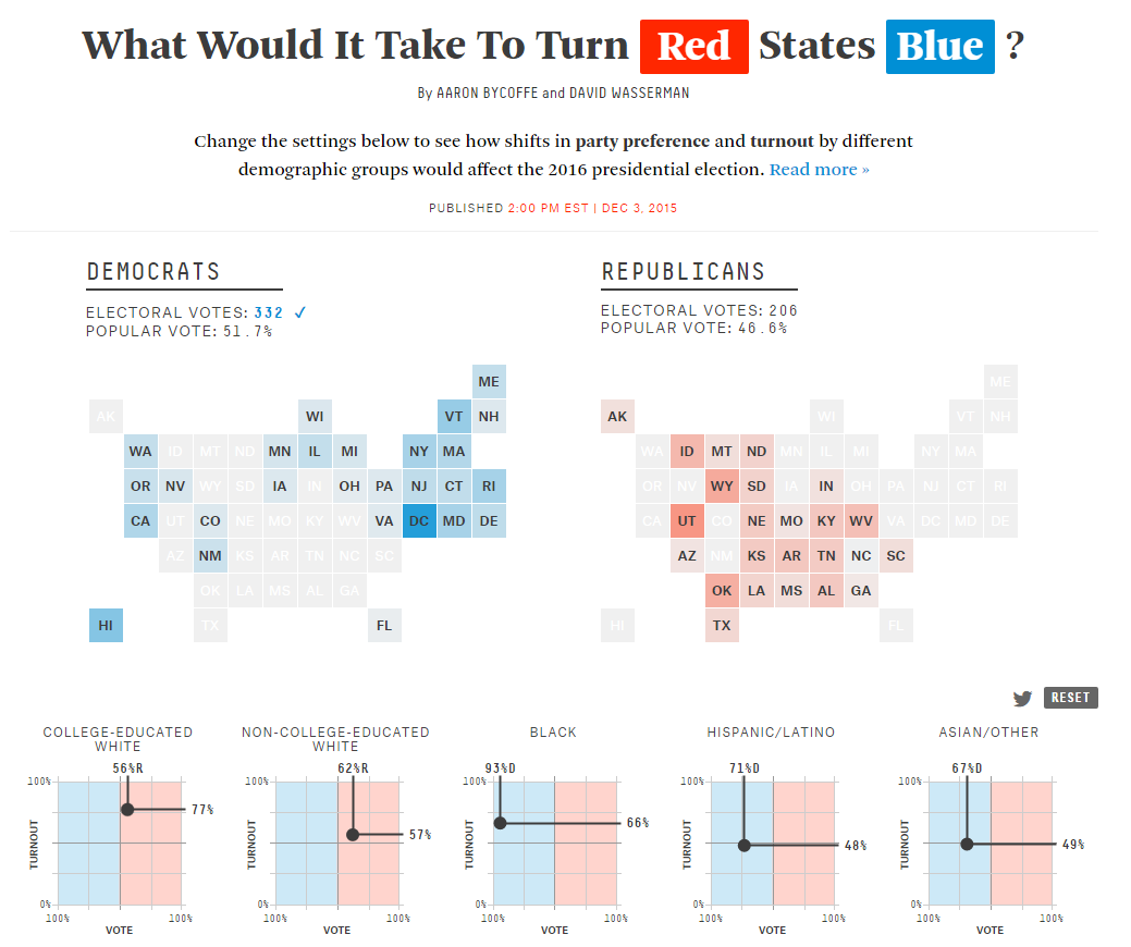
Besides being a stunning way to present What-If scenarios, I liked the usage of the Tile Grid Maps, which have become a pretty popular visualization lately. What is a Tile Grid Map, you ask? Well, think of it as a mix between a choropleth map and a table heat map. If you want to see more examples, you can visit Bloomberg, The Washington Post or The New York Times.
It is true that most of the times we strive for more accurate charts but ironically, this technique’s boon is that it disregards the actual size of the regions and translates them to equal-sized shapes (in this case, squares) so it becomes easier to see even the smallest areas. Therefore, this solution is excellent when the geographic size is not the most important thing, but maintaining a loose spatial distribution is.
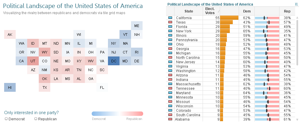
So anyways… In today’s tutorial we’ll build something like this:
Note: Most of the information presented here was taken from FiveThirtyEight’s post. I think those figures date from 2012 and since American politics isn’t amongst my favorite topics, I didn’t look for fresh data. Sorry about that.
As usual, you can find the QVW and data sources here.
Tutorial
1.- Let’s start by creating the skeleton of the map using a simple spreadsheet. You just need to create a matrix and arrange all the states as if you were playing Battleship.

[Some of my colleagues didn’t get that explanation… I’m feeling a little old now…]
2.- Create a new QlikView document and load this table using the CrossTable wizard (or just add the prefix manually).

3.- Load the rest of your data as usual.

4.- Create a Pivot Table using Row and Column as dimensions and only(State_ID) as expression.
5.- Go to the Presentation tab and select Always Fully Expanded.

6.- Drag and drop the Column column in order to create a cross table (that sounded weird).

7.- Select Wrap Cell Text in the Presentation tab. While there, adjust the alignment of the cells as well.

8.- Let’s get rid of those annoying NULLs by opening the Presentation tab (again) and changing the symbols in the lower left corner to spaces.

9.- Now, in order to clean our visualization perform the following actions:
- Caption: Disable Show Caption
- Layout: Disable Use Borders
- Style: Set Cell Borders Transparency to 100%

10.- Since we are working with a Pivot Table, we cannot simply suppress the header row and hide the first column so it’s time for the nasty tricks. Activate the Design Grid (Ctrl + G) and right click on the header of the first column (the gray cell). Select the Custom Format Cell option and change the Background and Text colors to white.

11.- Perform the same steps with the first row (right click on any of the numbers) and the first column (right click on any of the letters). Your table should look like this:

12.- Now, let’s apply some color to our visualization. Open the script and create two variables containing the RGB codes for the democrats and republicans:

13.- The trick behind this map is the ColorMix2() function, so let’s take a moment to understand how it works. ColorMix2 returns a color gradient based on four parameters: a value from -1 to +1, the color for -1, the color for +1 and the color for 0. Since we already defined all these codes, the last 3 parameters are simple:

14.- However, the first one is a little trickier. We need to translate our democrat and republican percentages (0% – 100%) to a new scale ranging from -1 to 1. We can easily achieve this by applying a Min Max Normalization:

If you’re familiar with this technique, jump directly to step 15. For those of you who aren’t, let me explain it a little further. Let’s imagine there’s a state with 75% of democrats:

As you can see, we have two scales: the % of Democrats (0% > 100%) and ColorMix2 (-1 > 1). Since this state falls exactly in the middle between 50% and 100% in the first scale, it should be exactly between 0 and +1 in the second one, right? Let´s apply the formula using only the right–hand side of the scale as a reference:

That would be (.75 – .5) / (1 – .5) = +0.5, which looks OK according to our diagram.
So, in the end, if we apply this formula from the democrat and republican points of view, we’ll end up with something like this:

15.- Our ColorMix2 formula is now ready, so let’s use it as the Background Color for our expression:


16.- Our map should look like this. Pretty neat, right?

However, there is a little problem… If you select one state, the map practically disappears!

17.- We can avoid this behavior by telling the expression to “ignore” the selections made in certain fields (yep, Set Analysis). Change the table’s expression to this one:

Now, the maps remains intact even if you select a party or a state:

18.- Another improvement that I’d like to make is to color the “inactive” states in gray so we don’t lose the shape of the map when we make selections. Let’s add these lines to the Background Color expression:

Since the length of the state would only be greater than 0 for the possible values (either selected or related), this conditional statement will color the “active” states with ColorMix2 and use gray for the rest.

19.- In order to reinforce this “Active / Inactive” visual cue, let’s hide the states’ name whenever it is unavailable:


20.- Add some extra labels and filters. Voilà, our Tile Grid Map is now ready!
What do you think about this type of visualizations? They surely sacrifice some things, but they offer other benefits. If you have any comments, be sure to post them in the section below. Thanks for reading. Until next time!
PS: Help me achieve my lifelong dream of having more <Followers> than <Following> in Twitter: @QlikFreak!

Love this. Especially like the spreadsheet template approach.
When I select a state form the pivot table, the sorting comes in action. The view is distorted. Help!!
Try Sort > Text A -> Z in both the row and columns. Also you can try copying and pasting the object from the material and just changing the field. I think this issue may have to do with the set analysis bit of your expression. Are you “ignoring” other selections?
Good job! Can you please make available the qvw file?
Sure, there was an issue with the link, but it whould work now:
https://www.dropbox.com/s/0zi37otbcwk6c7g/Tile_Grid_Map.rar