I was wandering around my usual QlikView blogs when I found a post by Rebecca Camper (follow her design blog, INTUIQLIK for stylish ideas!) where she showed some cool data visualizations from Simon Spring, a canadian designer. All of them were easy to the eye, but I found this one especially interesting: 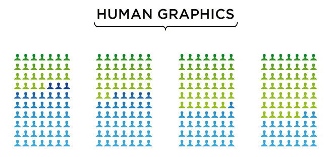 Coincidentally, later that day I found this other post in LinkedIn that used infographics to illustrate employee satisfaction. It showed some curious numbers about why people stay in their jobs, reward systems and work-life balance.

So anyway, long story short, inspiration came and here’s the second volume of Infographics in QlikView. As you remember, in our last tutorial I showed you how to use bar / block charts, images with transparency and layers to create something like this: 
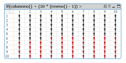
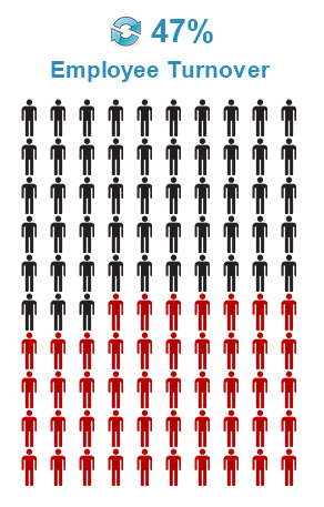
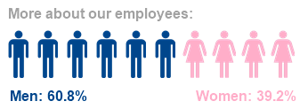
Today, we’re going to work with pivot tables and some images to create these: 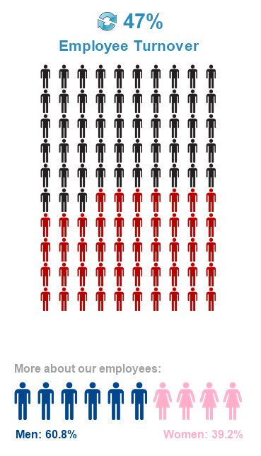
Tutorial
As always, you can download the ZIP package that contains the QVW, images and data sources needed to create all the objects shown above.
1.- First, we will create a pivot table with two calculated dimensions (same expression for both):
2.- Add the following expression:
 3.- Expand the whole table. Drag and drop the second dimension to the top border in order to create a cross table.
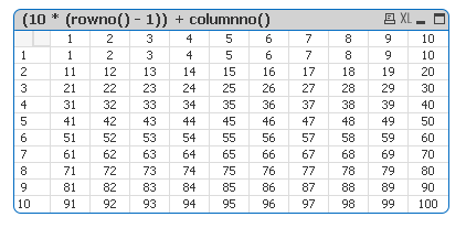
4.- As you can see, we have created a matrix that goes from 1 to 100 (I’m sure you now know where this is headed). Change the current expression for this one:
We’re comparing every cell value against an expression and assigning an image in response. In this case my calculation represents the employee turnover of the company. If you’re using a percentage, remember to multiply it by 100
5.- In the Expressions tab, go to Display Options. Select Representation: Image and Image Formatting: Keep Aspect.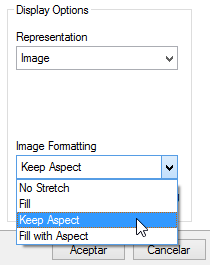
6.- The chart is now fully functional, but it may need some extra formatting.
7.- Remove the caption
8.- Remove the borders
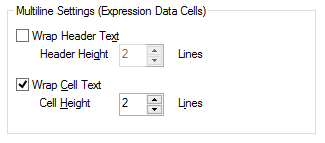
9.- In the Presentation tab, select Wrap cell text > 2 lines
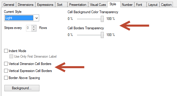
10.- In the Style tab remove the vertical cell borders (dimension and expression). Also, set both transparency bars to 100%.
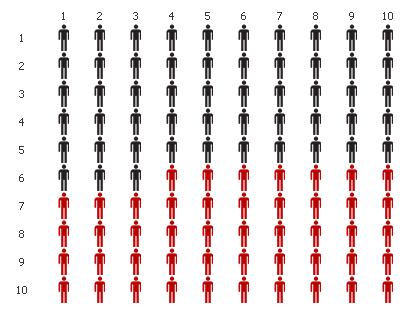
11.- Your chart should look like this:
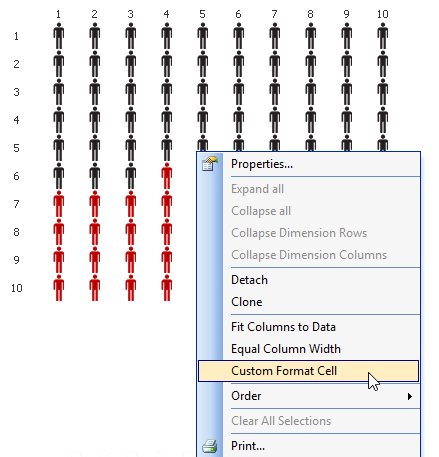
12.- In order to hide those numbers, activate the design grid (CRTL + G) and in the menu, select Custom Format Cell. (This option may not be available if you don’t activate the design grid).
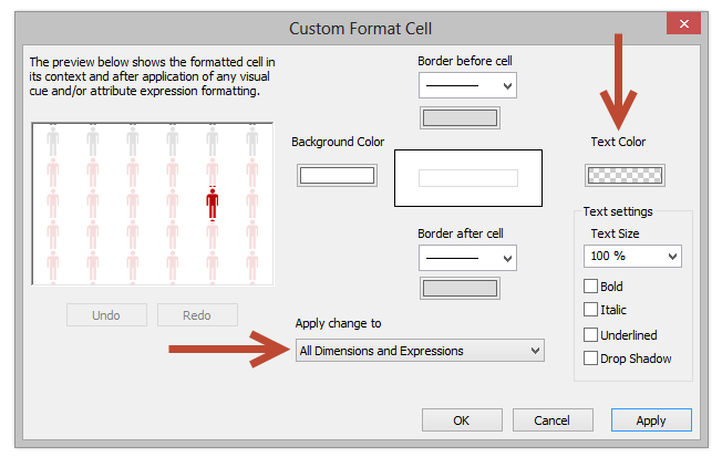
13.- Set the Text color to white or transparent and apply the change for all the dimensions and expressions.
14.- Adjust the column width and include some icons and text objects.
Voilà! Infographic created. You can also simplify this chart by removing one of the dimensions to create a single row instead of a matrix. Some detail may be lost, but it is a smaller object.
Well, I hope you liked today’s post. Any suggestions or ideas? Leave a comment in the section below!





Those data visualizations aren’t mine.
Clarified!
Thanks! 🙂 Good post!
Nice implementation. I much prefer this to have transparent objects around the place. I’m doing an HR app at the moment – so may need to drop in one of these. Thanks!
Excellent !!!
This example is exactly I need to meet a requirement.
Excelente post. I’ll be implementing this in the near future 🙂
Hi why i cant go through the third steps where First and sec calc variables show “FirstVar”, “Sec Var” on the A1 and B1 cell on Pivot table, not 12345678910 ?
thx
Hi,
The steps to create the matrix that goes from 1 to 100 are:
1. Create the objet (Pivot Table)
2. Click Next
3. Add Calculated Dimension > ValueLoop(1, 10)
4. Click OK
5. Add Calculated Dimension > ValueLoop(1, 10)
6. Click OK
7. Click Next
8. In the “Edit Expression” dialog add a dummy expression > 5+2
9. Click OK
10. Click Finish
11. You should have a table with one column that goes from 1 to 10 and another with the value “7”
12. Right click on the first column > Expand All
13. Drag the second column (from the header) and drop it over the third column
14. Change the expression “7+2” to “(10 * (RowNo()-1) + ColumnNo()) ”
15. Done
Tell me if it solved your problem
Yes, it solved the problem. Appreciate for your kindly help. Thx Julian.~~~~~
Hi Julian.
how do I get the word “ValueLoop” out of the calculated dimension?
thanks
Julian, Mine is showing only little men no ladies…can I send the model to you somehow?
Sure Lorna, you can upload it to Dropbox and share the link here so I can take a look 🙂
hi Julian
thanks so much.
the information in the model is quite sensitive…I wouldnt want to share here.
can you provide me with an email address I can share with?
thanks
You can post the link here or send it by email if your model has real information
Hi, The link to download doesn’t work, is it available anywhere else or can you please email it to me?
Thanks
I checked the link and it’s OK, maybe it’s the network blocking DropBox… But if you send me your email I can send it directly to you 🙂
Thanks for sharing i can’t wait to implement these tricks in my applications 🙂
Hello,
I tried the turnover chart and when i add a line with the value 80 % ,81 men’s turned red , can’t figure out the problem o.O,
Best Regards.
I think it might be the decimals… have you tried using floor() to bring the number down?
Hi,
I tried round() on the second part of the expression and it works well now , thanks for the reply
Thanks for sharing this wonderful post, Infographics really help us grow. I would appreciate this blog.